Google’s AI assistant is getting a dramatic makeover, and iPhone users are already buzzing about the changes.
The new Gemini iOS redesign introduces a visually rich interface packed with flowing animations, translucent effects, and a more organized navigation system. The refreshed look began appearing for select users on May 2, 2026, representing the biggest transformation the app has seen since its debut.
For many users, the update instantly changes how Gemini feels. Instead of a static chatbot interface, the assistant now appears more dynamic, polished, and responsive.
Gemini iOS Redesign Introduces Animated Backgrounds
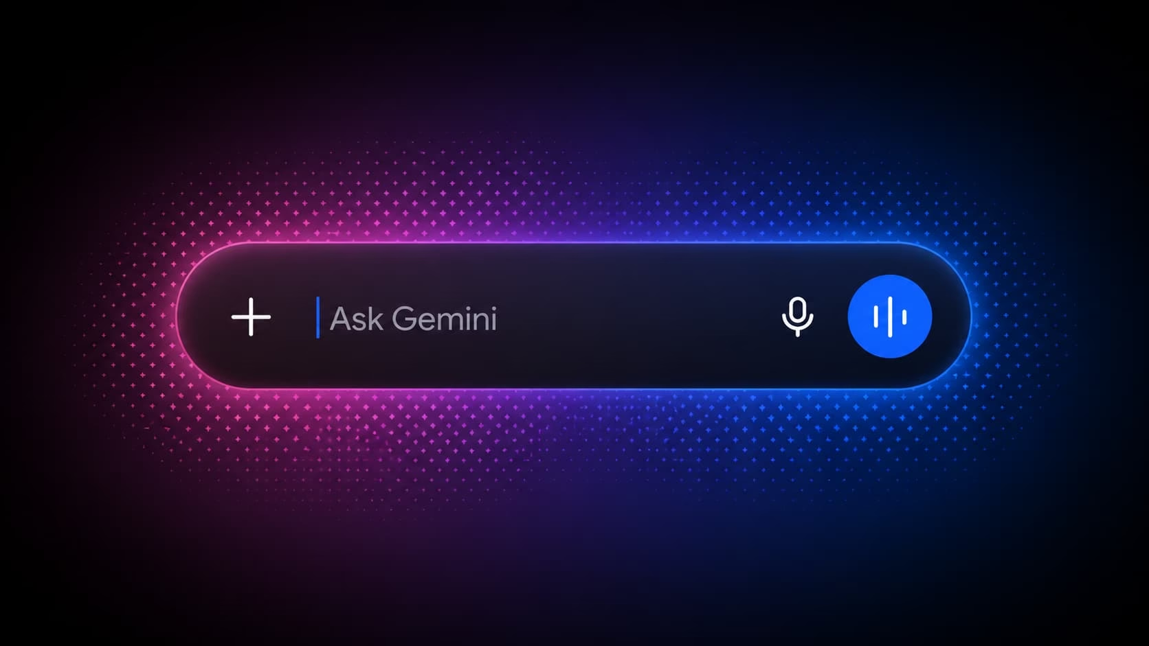
 At the center of the redesign is a constantly shifting multicolor gradient that moves beneath the prompt area. The animated background reacts subtly during interactions, giving the interface a smoother and more modern personality.
The prompt box now sits prominently beside the Gemini logo while the colorful backdrop transitions fluidly behind it. The result is a cleaner layout that feels more interactive and visually alive.
Rather than overwhelming the screen with motion, Google appears to have focused on restrained animation that enhances usability without becoming distracting.
Unified Menu Brings All Tools Together
One of the biggest practical changes arrives through a redesigned plus button.
Instead of scattering tools across multiple sections, Google now places everything into one centralized menu. Users can quickly access Photos, Camera, Files, Notebooks, Images, Videos, Music, Canvas, Deep Research, and Guided Learning from a single location.
That streamlined approach removes extra navigation steps and makes the app feel far more cohesive.
The same menu structure already exists on Gemini for Mac, while similar testing is reportedly underway on Android and desktop web versions.
Liquid Glass Styling Gives Gemini a Premium Feel
 The Gemini iOS redesign also leans heavily into Apple-inspired Liquid Glass visuals.
Semi-transparent layers, softer edges, and glass-like interface elements now appear throughout the application. Meanwhile, spacing between buttons and menus has been refined to improve readability and create a less cluttered experience.
Google also relocated the model picker to the top-left corner of the app. It now appears as a dropdown menu featuring thinner icons with rounded outlines.
The aesthetic shift makes Gemini look more aligned with modern iOS design trends while still maintaining Google’s colorful branding identity.
Limited Rollout Leaves Many Users Waiting
Despite the excitement online, the redesign is still only available to a limited number of iPhone users.
Google has not confirmed a broader release timeline, and Android users remain uncertain about when the visual overhaul could arrive on their devices.
The redesign first gained widespread attention after Reddit user u/TaxOld2989 shared screenshots of the updated interface. Since then, discussions across social media and tech communities have intensified as users compare the new experience with earlier versions of Gemini.
For now, many users are refreshing the App Store and waiting for access to what could become Google’s most visually ambitious AI redesign yet.